
How to customize your protection form
If you want to customize your content protection form’s design, you can do so with Passster. This guide will walk you through how to customize the form’s content and design.
Customize your form’s content
If you want to customize your protection form’s content throughout your whole site, you can do so with Passster. Alternatively, you can customize it/overwrite the form’s content for each page. See our page protection guide for details.
If you’d like to customize your form’s content for your whole site, take the following steps:
- From your WordPress dashboard, go to Passster > Settings and open the General tab at the top.
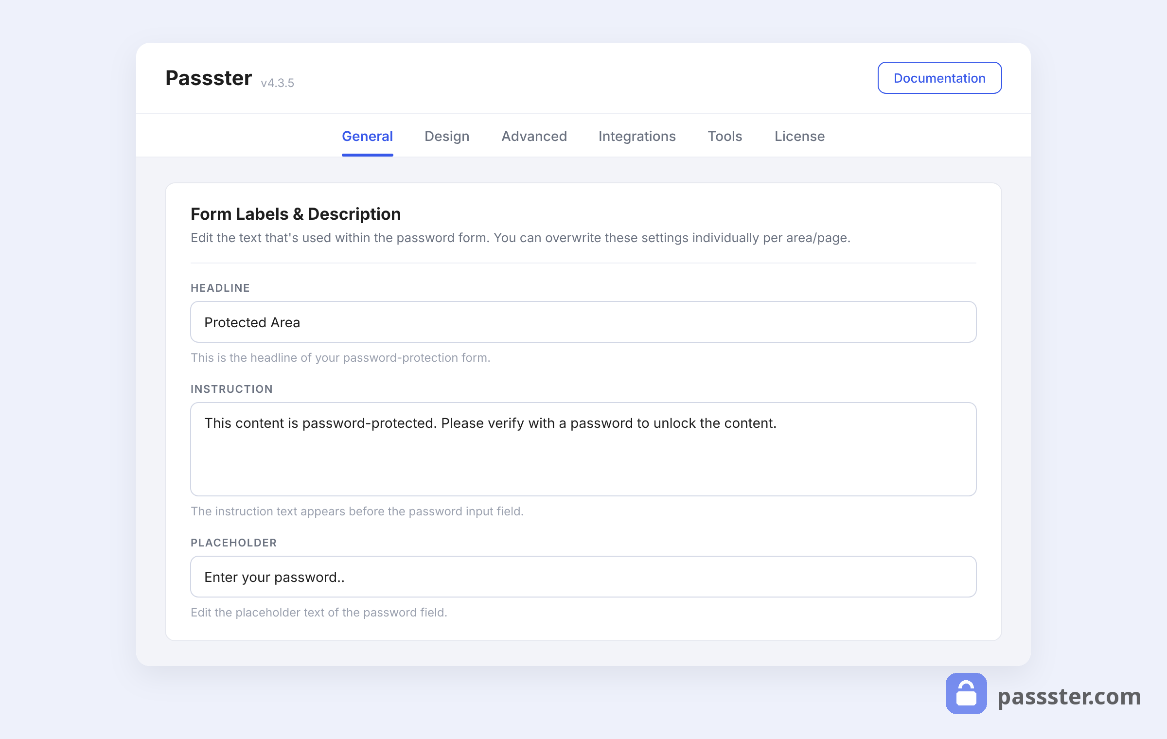
- In the Form Labels & Description section, you’ll see each element of your protection form’s content. By default, these contain some standard text, but you can customize each section of the form’s content to suit you.
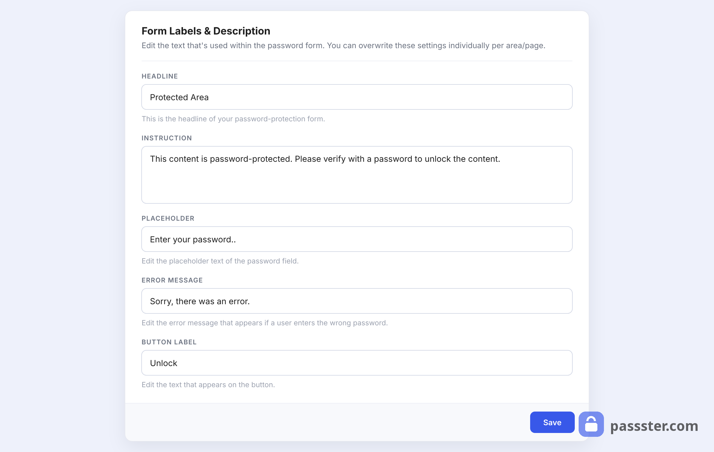
- Once you’re happy with your form’s content, click the Save button at the bottom of the Form Labels & Description section.
Customize your form’s design
We’ve changed what your protection form contains/says. Next, we’ll customize the design of your protection form.
To customize your protection form’s design, take the following steps:
- From your WordPress dashboard, go to Passster > Settings and open the Design tab at the top.
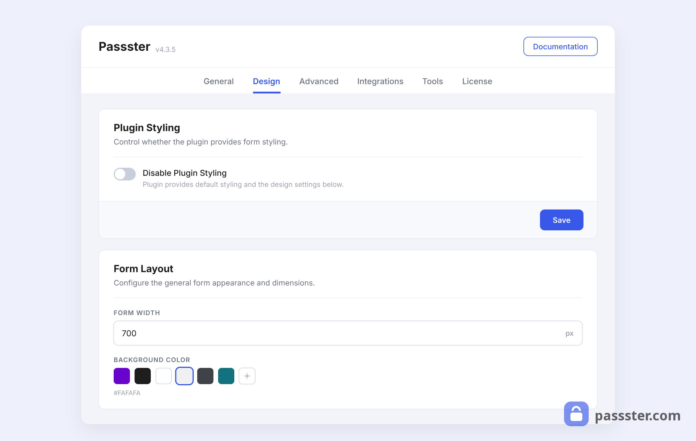
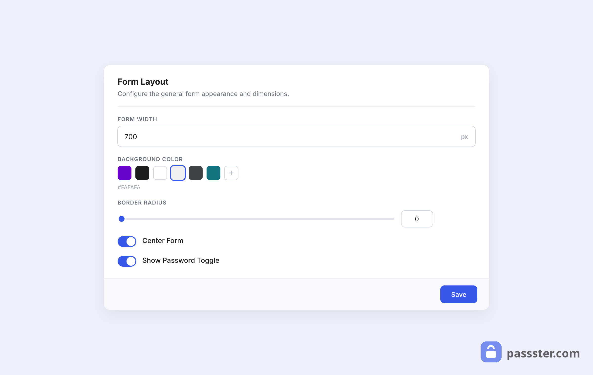
- The Form Layout section lets you customize everything from the form width, to the background color, border radius, centering, and more.
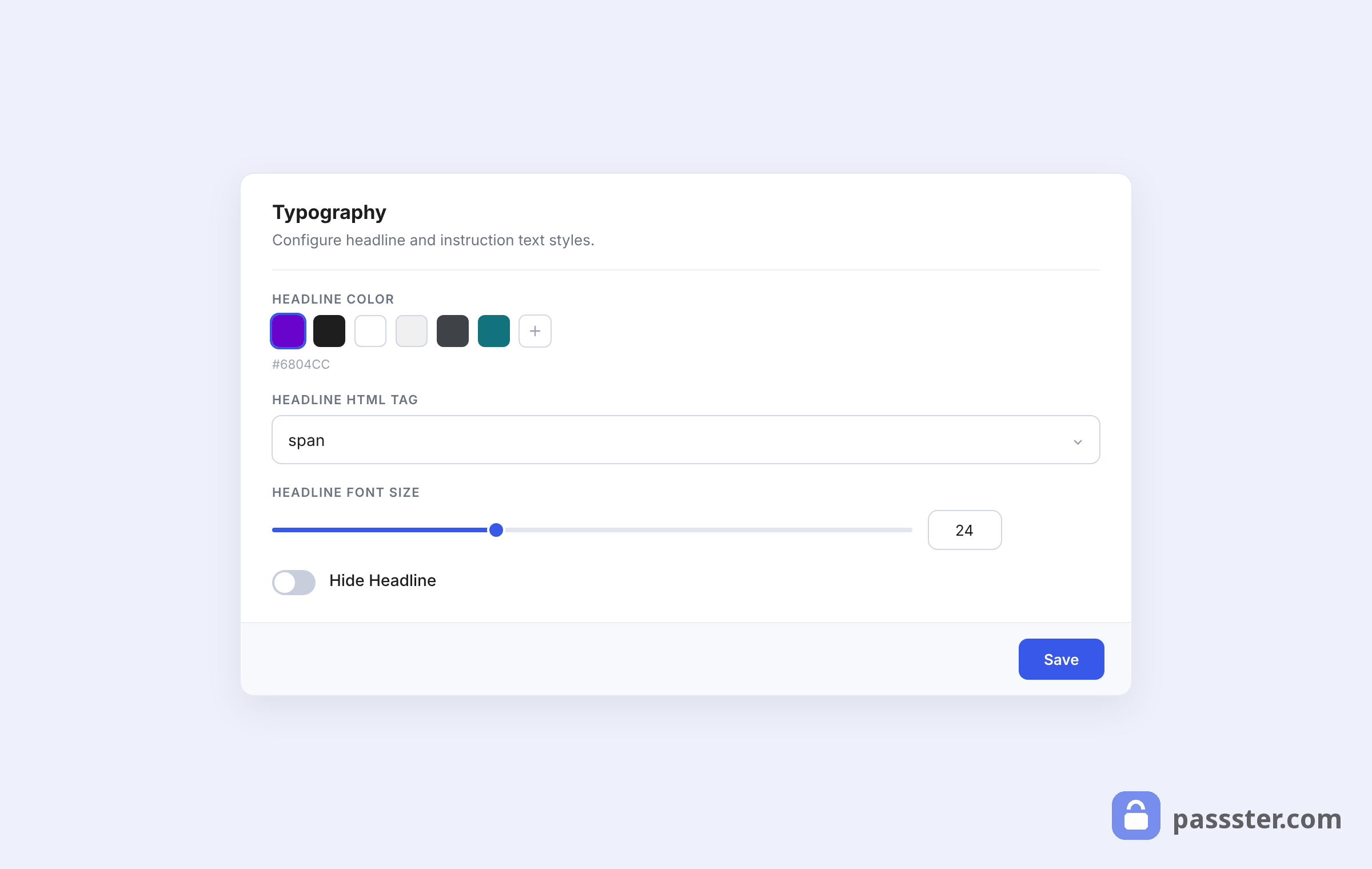
- The Typography section gives you control over your form’s headline design. Change the color, HTML tag, and font size here.
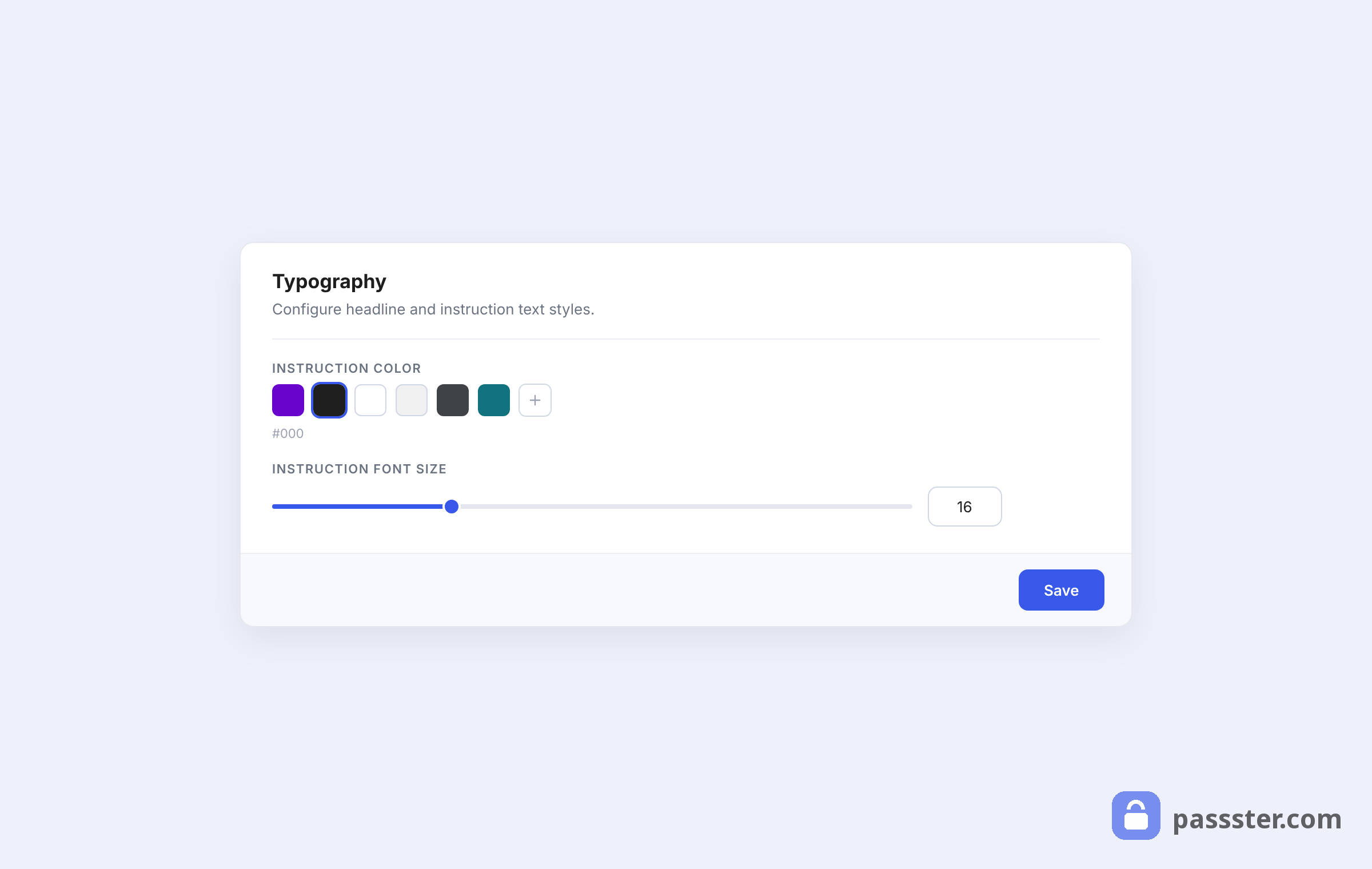
- Typography also covers your form’s instruction text. Change the font color and size here.
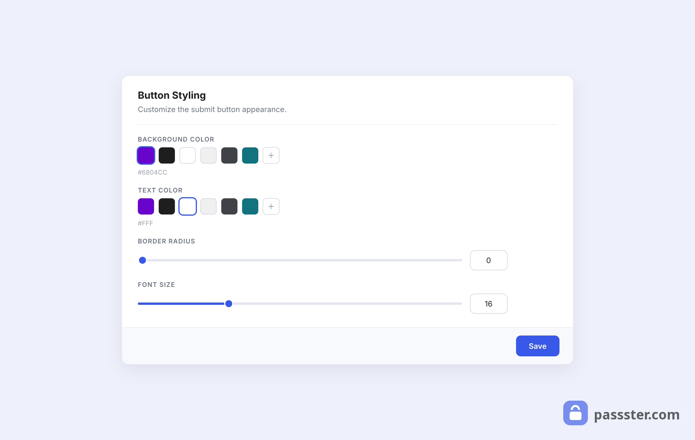
- Button Styling allows you to customize your form’s button design, including the background color, text color, border radius, and font size.
- Once you’re happy with all your style changes, click the Save button in each section you’ve changed.